When you click each squares on the top row, you will be able to choose different colours for the text which you plan to use on your website. The labels above each square indicate where the font will be seen on the example page, this can be turned off. The three vertical squares on the left side of the grid are for choosing background colours and when clicked will let you choose background colours. Again, the labels indicate where the colours are going to be used on the example page, but can be turned off if desired. The contrast ratio results are organised in the 4x3 grid. Each row relates to its respective background colour, while the columns relate to their respective text colour. Thus the first results square (reading from left to right, top to bottom) shows the contrast ratio score of the first background colour and first text colour, while the second results square is the contrast ratio score of the first background colour and second text colour, and so on.
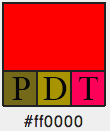
When you select a colour and you have confirmed it the results table will update accordingly. Within the palette colour squares you will see the colour vision deficiency simulation. The first smaller square is for Protan simulation (P), the second for Deutan (D) simulation and the third for Tritan (T). For example:

The HEX value (e.g., #FF0000) for each of the palette block displays underneath so that you can copy the colour code easily to put into your files. When looking at the results table there are a number of things to look out for. If you look at these two examples:


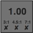
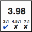
The image on the left shows how the results square will look if no minimum contrast level is met. The background colour becomes darker making it easier to find the squares where there is a pass. The image on the right demonstrates this. Notice the tick for pass is in blue so that again it stands out more quickly. The number in large text shows you the actual contrast ratio so that you can see how far away from a pass or fail two colours are. The WCAG ratio levels are also shown so that you are aware what size the text needs to be at that pass level. More information about this can be found here and here.
Once colours have been chosen, click the link to see the example page. Hover over the header menu to see different CVD simulations of the colour scheme. You can return to the palette tool to make changes and will only need to refresh the example page to see the updated colours.